My wife and I just moved into a new house, and I finally have a “man cave”. That means I need (yes, need) to buy a television to be the centerpiece, and I’ll be shopping online.
I figured I would use this opportunity to talk you through the anatomy of a good eCommerce product page. There are some good ones out there, and some really bad ones, and I’d like you to know the difference. Plus, I get to shop for a TV while I work!
We’ll look at four examples that represent four different levels of product listing maturity. I’ll also help you understand what you need to do to improve your product listing pages.
Evaluation Criteria
Before we dive into the evaluation, I want to be clear that even though I’ll be a little rough on some of these retailers, its to educate–not to speak poorly of someone’s business. Bigger mistakes tend to come from smaller businesses, and I commend anyone trying to run a retail business as their livelihood. The goal of this evaluation is to show you what bad and good looks like, so that you have a clear picture of what to strive for.
I want you to learn from others’ mistakes, so you don’t make them.
The following criteria are used to evaluate each of the product pages in this article.
Product Attributes
How effectively does the webstore use product attribute-driven navigation to allow me to drill down to the exact product I want? This is the “Amazon experience”. This is what most people expect from an eCommerce site. When you fail to deliver that experience, you lose potential customers to a webstore that can.
Product Content
How well are the products described on the product page? Are they clear and organized? Is all the relevant information present?
Effective presentation of product content is a combination of good data management and well designed eCommerce store templates. It’s not always an easy thing to pull off.
Search Engine Optimization
How effectively did the eCommerce merchant optimize the page to be found by search engines like Google. SEO is one of the most effective ways you can bring traffic to your site, and when done correctly it has virtually zero cost.
Social Proof
Break down what it means to convince someone to buy from your eCommerce store. It means you’re convincing them to send money to a stranger they’ll never meet in hopes that the stranger will send back something that matches the few pictures on the website. The buyer takes on a lot of risk.
Therefore, it is your responsibility as the seller to earn the customer’s trust. Using SSL for sensitive transactions, demonstrating proper certifications, and creating a professionally designed webstore are all ways to do that. One of your most powerful trust-building opportunities is to provide customer reviews.
When a customer sees that other real people have completed the purchase, and (even better) were happy with it, the anxiety to click “Add To Cart” starts to melt away. I’m not just making this up. It has been studied.
Recommendations
Cross-selling and up-selling is a huge part of retail, and it’s the responsibility of your product page to make that happen. Merchants leave all kinds of money on the table when they don’t recommend related products that customers would add to their carts on impulse.
Now that we’re clear on the criteria, let the evaluations begin…
Bad: Columbus Television & Appliance
I live in Columbus, OH and would like to try to give my business to someone local. So, when searching I came across Columbus Television & Appliance.
Now, I did make one mistake. This store is in Columbus, TX, which is a bit of a drive for me in Ohio. But, let’s disregard that for the sake of education.
The name of this company and website would suggest that I could purchase a television in Columbus. The webstore does not have a single television listed, nor any mention of televisions. This is a prime example of bringing the wrong people to your site with SEO. More traffic is not helpful if its the wrong traffic. This store attracting Columbus television shoppers is not helping their business grow.
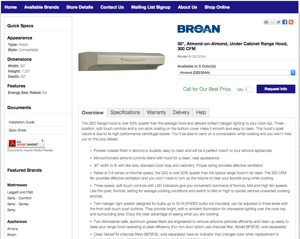
That said, let’s keep analyzing with this product, a range hood…again, for the sake of education.
Product Attributes
I was able to find some attribute-driven navigation…kind of. But, to get there, I had to click through a few layers of raw content pages. In fact, for a while, I wasn’t even sure this was an eCommerce site. It just looked like a content site designed to get someone into the store.
When I did find the attribute driven navigation, it used unconventional filters for drilling down to the right size of product. They ask for minimum and/or maximum values. I totally understand the concept, but giving the user so much freedom is more confusing than helpful.
Product Content
They get some points here for providing quite a bit of product content. The product is relatively well described, and there is even a Quick Specs section above the fold. They do provide multiple product images, albeit the quality is poor. But, there are two major problems with the product content.
First, there is no pricing. Again, I’m still not even sure this is an eCommerce site that I can purchase from, even though it says shop online. How do I buy something online for which I need to “call for a quote”? This user experience is confusing at best, frustrating at worst.
Second, there is so much content on this page that its overwhelming. Kudos for providing detail, but most of that detail is just part of a wall of text. Better attribution and a better visual layout would make this information much easier to digest.
Search Engine Optimization
In terms of SEO, they get a passing score on the product page. Here’s the page title:
QS230BL in Black by Broan in Columbus, TX – 30″, Black, Under Cabinet Range Hood, 300 CFM
It’s loaded with the right keywords, including the location. It also includes the item number. Some of the relevant keywords are included in the URL as well. The URL could be improved a little, but its acceptable. In terms of product page SEO, this is about what you want.
One level up, the category page is much different. They use a generic page title, which I assume is used throughout most of the site:
Home Appliances, Home Electronics, TVs, Televisions in Columbus Texas | Columbus Television & Appliance
(Again…where are these televisions?)
This title would be appropriate for the home page, but that’s about. This category page title should describe what I’m looking at which is a category for under-cabinet range hoods. That way someone in Columbus who is looking for a range hood might find this page.
The URL for this page is a mess too, and it likely has to do with the maturity of whatever technology platform they are using. This is not an SEO-optimized URL, and there probably isn’t much they can do about it, short of changing eCommerce platforms.
Social Proof
This product page displays no social proof, failing to nudge me to purchase. A site this assumedly small is not likely to get much user-generated content on their own, so it is better to do nothing than to provide empty “reviews”. However, I would recommend leveraging a platform that brings in reviews from elsewhere to establish social proof.
The page does provide social media share icons, but they are very small and unlabeled. I wasn’t sure if I was clicking a “share on Facebook” button or a “visit our Facebook page” button.
Recommendations
Not only does this page not include recommendations for related or upgraded products, it distracts me with completely unrelated ones.
One of the bolder elements on the page is an icon encouraging me to download Adobe Reader. That’s a rabbit hole that does not have a product purchase at the bottom.
The page also includes links to mattress brands. It’s fine if your business model is to sell appliances AND mattresses AND electronics, but a shopper is unlikely to want all of them at once. This kind of cross-selling is a distraction.
Okay: Appliance Center
As I mentioned, I would like to try to buy from a local Columbus company. I also found Appliance Center, who actually is located in Ohio. While they do a better job than Columbus TV and Appliance, there’s a lot of room for improvement.
Product Attributes
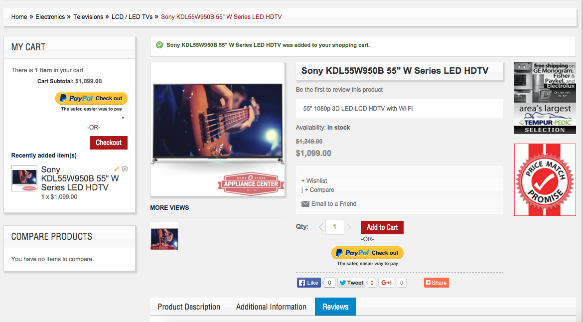
The first thing you’ll notice is that there is very little attribute-driven navigation. I have to select my product type first, which is not uncommon for a company that sells many types of products. But, then my only other drill-down option is size. As a shopper, I care about a lot more than just size.
There are two other major issues here:
- There are more size options than there are TVs listed on the site.
- Combining LED and LCD (an older standard) TVs is a big miss. These are for very different sets of customers.
Product Content
Appliance Center does not carry any of the brands I’m looking for, but for the sake of argument, let’s say I’m interested in this one.
The layout of the product pages makes the most important information hard to find. The product name is not very big and is pushed to the right. The description shown above the fold is concatenated gibberish. And, they only provide one, low quality image. The overall look and feel is distracting and dated, which reduces my trust in the brand.
That said, below the fold, the page does provide more detail about the TV, including some technical specifications. This could certainly be beefed up (compare it to the listings you’ll read later in this post), but it’s a start.
Search Engine Optimization
Let’s take a look at the HTML title on this page:
Sony KDL55W950B 55″ W Series LED HDTV
They did some good things and some bad things. They do include some important keywords like “Sony”, “LED”, and “HDTV”. And, they get bonus points for adding the item number to attract searchers who know exactly the product they want. However, they are missing other important bits if information that could help them target more keywords.
A local store like this has to approach SEO differently than a big box retailer. They likely won’t have the domain authority or brand recognition to rank as well as someone like Best Buy (see later example). If you’re in this position, you have to be more creative.
By adding “in Columbus, OH” to their SEO title, this retailer could have targeted people who are shopping in central Ohio and want to buy locally. This won’t be everyone that comes to your webstore, but it taps into an audience that national retailers like Best Buy or HHGregg have less ability to leverage.
Social Proof
This page includes a spot for reviews, but there aren’t any reviews.
This is a risky bet for a small retailer. You have to assume that you’ll need a good amount of sales before you have enough people to leave reviews. If someone like .5% of customers leave a review, you’d have to sell 200 of just that product online for one review!
Leaving a space for reviews that remains empty is worse than just not adding that to your site. I would recommend utilizing a shared user-generated content system, like BazaarVoice or Yotpo, to leverage someone else’s scale. This would help you provide reviews on your site without having to generate them yourself.
Or, if you are dead set on generating reviews organically, try giving your customers some kind of incentive for reviewing their purchases.
Recommendations
The closest thing this product page has to up-sell or cross-sell recommendations is a small, not clickable banner that advertises two things that don’t matter to me: free shipping on kitchen appliances and the fact that they have the area’s largest Tempur-Pedic mattress selection.
There’s a missed opportunity by not providing actual recommendations for related products. Even worse, they are recommending things that are distracting. If I’m thinking “TV” don’t tell me “mattress”.
Good: HHGregg
HHGregg, a national electronics chain, steps it up a bit with their product page listing, but there is still some room for improvement.
Product Attributes
When I started at the HHGregg homepage, I wanted to filter down to exactly what I want. Size of the TV, UHD picture quality, customer reviews, and price are what is most important to me.
HHGregg provides drill-down navigation to filter the televisions by three of the four criteria, but I cannot filter by customer review.
It’s also a little confusing to me how the attribute-driven navigation changes depending on what level I’m at. The first one is a link, then they become checkboxes with different options.
Product Content
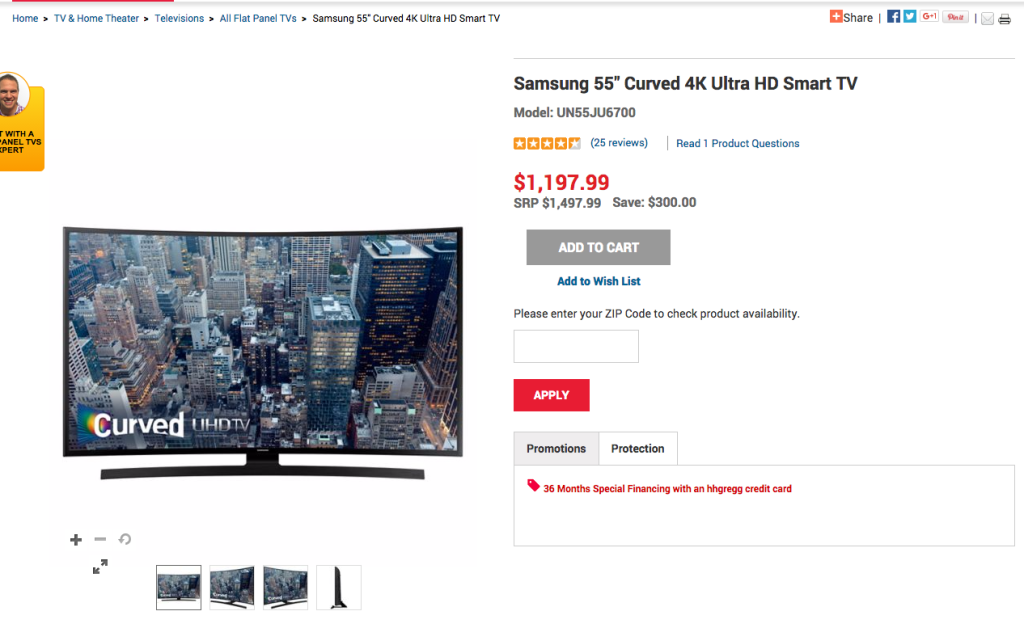
Once I arrive at the product I want to look at: 55″ Curved UHD TV from Samsung, I see that HHGregg has done a pretty good job with product content.
They provide a few high quality images of the product, and even include a video product demo. For a television, video is kind of irrelevant, but for the right kinds of products video can be very effective.
All of the important pieces of information like the product name, price, and rating are above the fold.
Not far down the page is a tab control that contains all the nitty gritty details for whomever wants to read them. They provide a very detailed product description and set of specifications.
However, this where the page starts to break down a little…
The “Q&A” tab only contains one very specific question, so its kind of useless and distracting. Worse yet, the “Resources” tab is just empty. These issues represent a clear disconnect between the product information available and the technology creating the customer experience.
Search Engine Optimization
HHGregg includes most of the relevant information for a television shopper in the title tag and URL for this product page. Here’s the title:
Samsung 55″ Curved 4K Ultra HD Smart TV | hhgregg
If I’m searching for a 55″ curved UHD television, this title is quite optimized for that keyword. However, they missed a huge opportunity.
Some shoppers know exactly what they want. They do their research before it comes time to buy. And, they may have the model number ready to search for. HHGregg did not include the model number in this SEO-critical title element, so a searcher using the model number is less likely to find HHGregg’s page.
Social Proof
Fortunately, HHGregg did provide customer reviews for the product. They are detailed and informative. My only complaint is that their layout is a little clumsy, including some minor UI bugs. It reduces trust in the website just a little bit.
But, they get a passing score here.
Recommendations
HHGregg kind of misses the boat on recommendations.
They do provide a widget for “Related Products” but they are all other TVs. That does fit one specific use case (I’m browsing and would like to see similar/competing products), but what if I’m ready to buy this one?
HHGregg provides no up-sell or cross-sell product recommendations. They make no attempt to get me to buy a bigger TV. They make no attempt to try to sell my a TV mount or a universal remote. These are real opportunities to increase the order value that they are not taking advantage of.
Excellent: Best Buy
Best Buy really knocks it out of the park with their eCommerce product page listing. In this example, I’m looking at a 55″ Curved UHD TV from Samsung.
Product Attributes
A lot of what Best Buy does right provides value before I even reach the product page. By properly attributing their products, I was able to start at BestBuy.com and drill down to exactly what I want.
Once I click into the product family that I’m shopping for (televisions), all the products are shown next a checkbox list of attributes I can use to narrow my search.
For televisions these include:
- Type of TV
- Size
- Brand
- Features
- Price
- Customer Ratings
And, the list goes on. Best Buy has provided enough options for drilling down into their products that virtually any interested buyer can find what they want using the criteria that is important to them.
When you make it easier for a customer to buy from you, guess what they tend to do more often.
Product Content
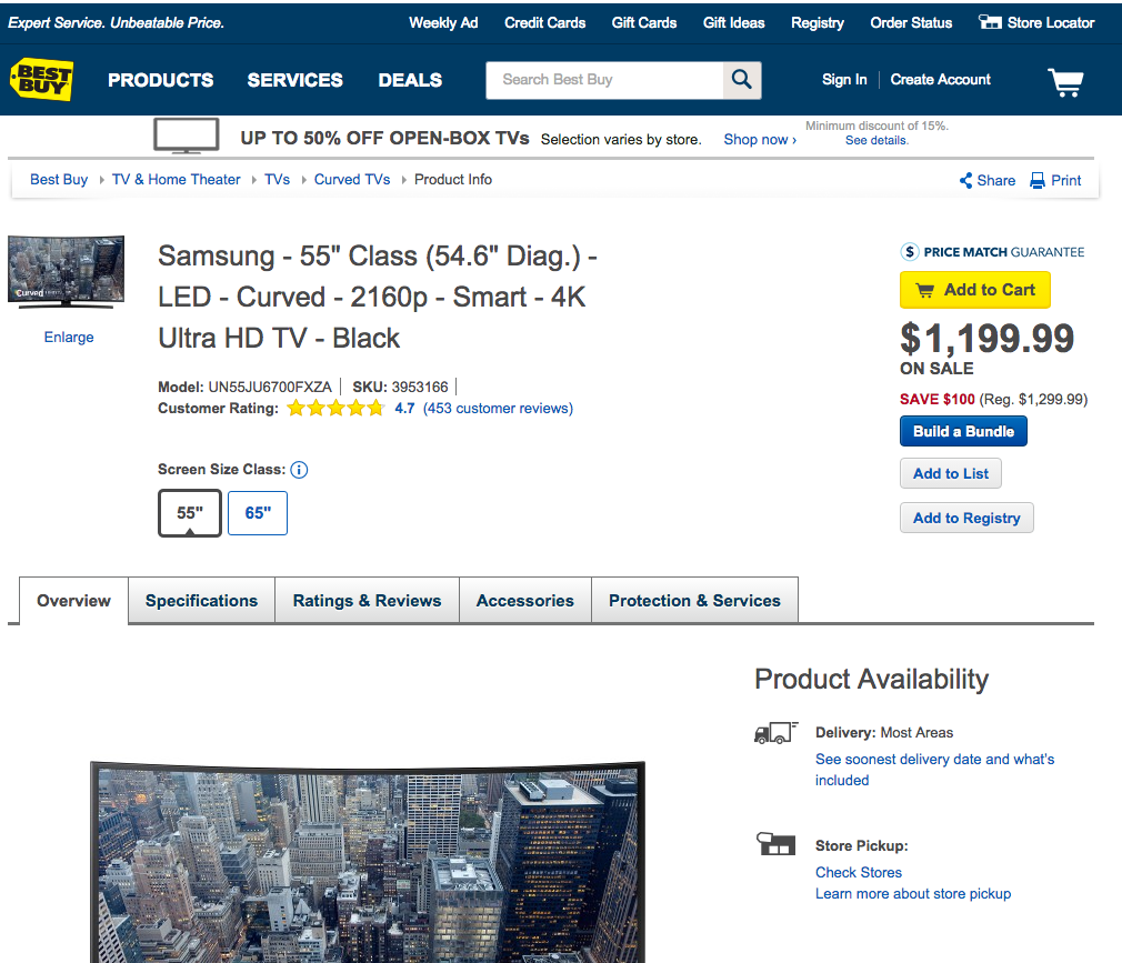
The first thing you notice on the product page itself is the immediate content that is available right above the fold:
- Product name & model number
- Price
- Clear call to action to “Add to Cart”
- High quality image of the product
- Toggle buttons that show the various sizes available for that model
Right away a customer can see the most critical information they could want to see. But, there’s more further down the page.
In the tab section below, Best Buy shares a number of high quality images of the television and a ton of very specific product attributes for the customer who is looking for something particular. It’s also well organized.
Search Engine Optimization
Take a look at the title in your browser for this page:
Samsung 55″ Class 54.6″ Diag. LED Curved 2160p Smart 4K Ultra HD TV Black UN55JU6700FXZA – Best Buy
Best Buy has included all the important terms that someone may use to search for this product in a search engine like Google. These terms are in the URL as well–another important ranking factor.
If I know exactly the television I want, and I search for model number, this result is #1 on Google. However, if I’m shopping around and I know I want a Samsung or a 55″ or a curved Ultra HD, all of those keywords are present. I searched for “samsung curved ultra hd tv” and the 65″ and 55″ versions were results #3 and #4 respectively.
Now, keyword optimization isn’t the only reason Best Buy ranks so well for this product page. Their domain has a lot of factors that indicate it as an authority to Google, and you can’t just flip a switch to make that happen. But, in smaller or more specific markets that don’t have a clear industry leader like Best Buy, making these SEO-focused changes can generate serious traffic to your webstore.
Social Proof
The info on this page checks all the boxes for me (the TV purchaser). I see the price. I see the description. I see the picture. But, at $1200 I’ve got a lot of anxiety about making the purchase.
Fortunately, Best Buy has provided social proof, in the form of reviews, to boost my confidence in the product. The content is clear, well organized, and easy to read. They are displayed prominently. There isn’t much else to say about it.
Recommendations
Finally, Best Buy has done an excellent job making up-sell and cross-sell recommendations for me. And, if you know anything about the electronics retail business, you know that this is where they make their money.
We already talked about the toggle button for switching to a bigger version of the same TV. They make it very easy for me to check out that more expensive 65″ model.
Then, in the “Accessories” tab, they remind me of all the related products I need to buy. Yes, I do need a new HDMI cable. Yep, I’ll need that TV mount. I guess a Roku would be kind of cool too. And, the “Add To Cart” buttons are all right there, so I don’t even have time to rethink it.
Even better, Best Buy placed these accessories next to the “What’s Included” section of the product page, so I can see very clearly that the HDMI cable and TV mount that I need are not included.
Do It Yourself
You can be like Best Buy. You should strive to be like Best Buy or Amazon or whoever you view as the leader in your industry. The differences between bad and excellent boil down to a few key concepts:
- You cannot put the right information in the right place or provide the right drill-down navigation experience for your customers without properly managed and attributed product data. Without this all the rest of these ideas are null and void.
- Your eCommerce site must be implemented properly, including using a sufficient technology platform. If the system is unable to store and display your attributes, it can’t handle multiple images, and/or it doesn’t output SEO-friendly URLs, you have a technology problem that must be solved.
- You need to approach how you list products on your store strategically and from the customer’s perspective. Simply blasting products to a website is not enough. We call this strategic approach product content strategy. And, you can learn more about it by downloading the eBook.





Please use darker font color, my eyes hurt
it is very nice article and good post thanks for sharing this article to us
i really like this article because i got good info about this article thanks for haring this article to us .best regards.
buying used laptops in hyderabad
[…] out what a good product listing page looks […]
Your blog so nice I appreciate you for the great job